● 로지스틱 회귀(Logistic Regression)
- 로지스틱회귀는 가능한 클래스가 2개인 이진 '분류'를 위한 모델
- 로지스틱 회귀의 예측 함수 정의
$$ \sigma (x)=\frac{1}{1+e^{-x}} $$
$$ \hat{y}=\sigma(w_{0}+w_{1}x_{1}+\cdots +w_{p}x_{p}) $$
- \(\sigma\): 시그모이드 함수
- 로지스틱 회귀 모델은 선형 회귀 모델에 시그모이드 함수를 적용
- 로지스틱 회귀의 학습 목표는 다음과 같은 목적 함수(Binary Cross Entropy)를 최소화 하는 파라미터 \(w\)를 찾는 것
$$ BinaryCrossEntropy=-\frac{1}{N}\sum_{i=1}^{N}y_{i}log(\hat{y_{i}})+(1-y_{i})log(1-\hat{y_{i}}) $$
import matplotlib.pyplot as plt
import numpy as np
from sklearn.datasets import make_classification
from sklearn.model_selection import train_test_split, cross_val_score
from sklearn.linear_model import LogisticRegression

# 분류용 샘플 만들기
# sample 개수는 1000개, 특성 변수는 2개, 중요한 변수도 2개, 노이즈(redundant)는 주지 않음, 클래스 당 클러스터 개수는 1개
samples = 1000
X, y = make_classification(n_samples = samples, n_features = 2,
                            n_informative = 2, n_redundant = 0,
                            n_clusters_per_class = 1)

# 생성된 분류용 샘플 시각화
fig, ax = plt.subplots(1, 1, figsize = (10, 6))
ax.grid()
ax.set_xlabel('X')
ax.set_ylabel('y')

for i in range(samples):
    if y[i] == 0:
        ax.scatter(X[i, 0], X[i, 1], edgecolors = 'k', alpha = 0.5, marker = '^', color = 'r')
    else:
        ax.scatter(X[i, 0], X[i, 1], edgecolors = 'k', alpha = 0.5, marker = 'v', color = 'b')
plt.show()
X_train, X_test, y_train, y_test = train_test_split(X, y, test_size = 0.2)
model = LogisticRegression()
model.fit(X_train, y_train)

print("학습 데이터 점수: {}".format(model.score(X_train, y_train)))
print("평가 데이터 점수: {}".format(model.score(X_test, y_test)))

# 출력 결과
학습 데이터 점수: 0.96625
평가 데이터 점수: 0.94

# 교차 검증 결과
scores = cross_val_score(model, X, y, scoring = 'accuracy', cv = 10)
print("CV 평균 점수: {}".format(scores.mean()))

# 출력 결과
CV 평균 점수: 0.96

# 모델의 절편 및 (두 변수 각각에 대한)계수 확인
model.intercept_, model.coef_

# 출력 결과
(array([-1.71965868]), array([[-2.66581257, -2.48697957]]))
# 시각화
x_min, x_max = X[:, 0].min() - 0.5, X[:, 0].max() + 0.5
y_min, y_max = X[:, 1].min() - 0.5, X[:, 1].max() + 0.5
# meshgrid는 격자를 만드는 것으로, x, y 각각의 최소-0.5와 최대+0.5인 값에서 0.02 간격의 격자 생성
xx, yy = np.meshgrid(np.arange(x_min, x_max, 0.02), np.arange(y_min, y_max, 0.02))
# ravel은 다차원의 배열을 1차원으로 평탄화(xx, yy는 원래 2차원 격자의 형태)
Z = model.predict(np.c_[xx.ravel(), yy.ravel()])
# 평탄화한 xx, yy로부터 예측한 결과인 Z를 다시 2차원의 배열 형태(xx의 형태)로 reshape
Z = Z.reshape(xx.shape)
plt.figure(1, figsize = (10, 6))
# 격자 히트맵 그리는 함수
# x(X의 첫 번째 변수)의 최소값에서 0.5 더 작은 값부터 x의 최대값에서 0.5 더 큰 값까지의 배열과
# y(X의 두 번째 변수)의 최소값에서 0.5 더 작은 값부터 y의 최대값에서 0.5 더 큰 값까지의 배열로
# 분류 클래스를 예측한 값 Z를 구하고 Z를 0.02 간격의 격자 배열로 변경하면
# 사각형 그래프 안에 0또는 1의 값을 가진 Z 격자가 0.02간격으로 분포되어 있을 것
# 각 Z의 값에 따라 색을 부여하면, 0인 영역과 1인 영역이 나눠질 것
plt.pcolormesh(xx, yy, Z, cmap = plt.cm.Pastel1)
plt.scatter(X[:, 0], X[:, 1], c= np.abs(y -1), edgecolors = 'k', alpha = 0.5, cmap = plt.cm.coolwarm)
plt.xlabel('X')
plt.ylabel('y')
plt.xlim(xx.min(), xx.max())
plt.ylim(yy.min(), yy.max())
plt.xticks()
plt.yticks()
plt.show()
- 붓꽃 데이터
from sklearn.datasets import load_iris

iris = load_iris()
print(iris.keys())
print(iris.DESCR)

# 출력 결과
dict_keys(['data', 'target', 'frame', 'target_names', 'DESCR', 'feature_names', 'filename', 'data_module'])

...

   :Attribute Information:
        - sepal length in cm  # 꽃받침 길이
        - sepal width in cm   # 꽃받침 넓이
        - petal length in cm  # 꽃잎 길이
        - petal width in cm   # 꽃잎 넓이
        - class:                        # 분류해야 하는 붓꽃 종류
                - Iris-Setosa        # 부채붓꽃
                - Iris-Versicolour  # 아이리스 버시칼라
                - Iris-Virginica     # 아이리스 버지니카

   :Summary Statistics:

    ============== ==== ==== ======= ===== ====================
                    Min  Max   Mean    SD   Class Correlation
    ============== ==== ==== ======= ===== ====================
    sepal length:   4.3  7.9   5.84   0.83    0.7826
    sepal width:    2.0  4.4   3.05   0.43   -0.4194
    petal length:   1.0  6.9   3.76   1.76    0.9490  (high!) # 상관관계 높음
    petal width:    0.1  2.5   1.20   0.76    0.9565  (high!) # 상관관계 높음
    ============== ==== ==== ======= ===== ====================

...- 붓꽃 데이터를 다루기 쉬운 데이터 프레임 형태로 변경
import pandas as pd

# 붓꽃 데이터를 데이터프레임 형태로 만드는 과정
iris_df = pd.DataFrame(iris.data, columns = iris.feature_names)
# 리스트 형태의 target 변수를 인덱스가 있는 series 형태로 변환
species = pd.Series(iris.target, dtype = 'category')
# series의 변수가 범주형일 때 .cat.rename_categories로 각 변수의 변수명을 바꿀 수 있음
species = species.cat.rename_categories(iris.target_names)
iris_df['species'] = species

iris_df.describe()
- 여러 그래프 그리며 EDA 해보기
# 상자 그림
iris_df.boxplot()
- sepal width는 값이 분포된 범위가 작지만 위, 아래로 이상치가 조금씩 존재
- petal length는 넓은 범위에 값이 분포됨
# 기본 선그래프
iris_df.plot()
- 0~50, 50~100, 100~150 정도의 범위에서 비슷한 경향을 가지는 것으로 보임
# 상관관계 산점도
import seaborn as sns
sns.pairplot(iris_df, hue = 'species')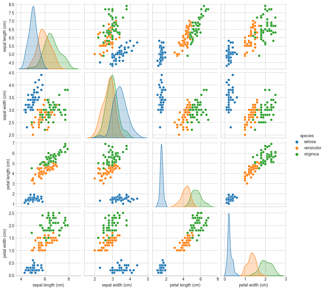
- 파란색의 target인 setosa는 나머지 두 target에 비해 그래프 상으로 잘 구분되어 실제로 분류하기 쉬울 것으로 예상
- 붓꽃 데이터에 대한 로지스틱 회귀
from sklearn.model_selection import train_test_split

# petal length, petal width에 대해서만(2번, 3번 인덱스의 데이터에 대해서만) 로지스틱 회귀 적용
# stratify는 target이 계층적 구조를 가질 때 도움이 되는 옵션
X_train, X_test, y_train, y_test = train_test_split(iris.data[:, [2, 3]], iris.target, test_size = 0.2, random_state = 42, stratify = iris.target)

from sklearn.linear_model import LogisticRegression
model = LogisticRegression(solver = 'lbfgs', multi_class = 'auto', C = 100, random_state = 42)
model.fit(X_train, y_train)

print("학습 데이터 점수: {}".format(model.score(X_train, y_train)))
print("평가 데이터 점수: {}".format(model.score(X_test, y_test)))

# 출력 결과
학습 데이터 점수: 0.9583333333333334
평가 데이터 점수: 0.9666666666666667
- 결과의 시각화
- 특성 변수(X)와 목표 변수(y) 배열 조정
import numpy as np

# vertical stack
# 배열을 수직으로(열에 따라) 병합
X = np.vstack((X_train, X_test))

# horizontal stack
# 배열을 수평으로(행에 따라) 병합
y = np.hstack((y_train, y_test))- Colormap 만들기
from matplotlib.colors import ListedColormap

# 각 값의 가장 작은 값에 1을 뺀 값에서 가장 큰 값에 1을 더한 값까지를 범위로
x1_min, x1_max = X[:, 0].min() - 1, X[:, 0].max() + 1
x2_min, x2_max = X[:, 1].min() - 1, X[:, 1].max() + 1

# 0.02간격의 격자 형태로 데이터 생성
xx1, xx2 = np.meshgrid(np.arange(x1_min, x1_max, 0.02), np.arange(x2_min, x2_max, 0.02))
# 생성한 격자 형태의 데이터를 데이터 분석을 위해 reshape하고 model에 넣어 predict한 값 Z를 생성
Z = model.predict(np.array([xx1.ravel(), xx2.ravel()]).T)

# Z를 다시 그래프위에 평면으로 표시하기 위해 2차원 배열(xx1의 원래 형태)로 변경
Z = Z.reshape(xx1.shape)

# Colormap을 위한 설정
# 목표변수인 붓꽃의 종류
species = ('Setosa', 'Versicolour', 'Virginica')

# 각 종류별로 표시할 모양
markers = ('^', 'v', 's')

# 각 종류별로 나타낼 색깔
colors = ('blue', 'purple', 'red')

# 목표변수 각각의 인덱스에 따라 색깔 지정해주기(0: blue, 1: purple, 2: red)
cmap = ListedColormap(colors[:len(np.unique(y))])

# 두 개의 특성 변수 xx1과 xx2을 좌표로 산점도를 그리고, 격자 형태의 Z값도 추가
plt.contourf(xx1, xx2, Z, alpha = 0.3, cmap = cmap)
plt.xlim(xx1.min(), xx1.max())
plt.ylim(xx2.min(), xx2.max())
# 반복문을 통해 예측된 목표 변수의 값에 따라 색깔, 모양, label 지정
for idx, cl in enumerate(np.unique(y)):
    plt.scatter(x = X[y == cl, 0], y = X[y == cl, 1], alpha = 0.8,
                c = colors[idx], marker = markers[idx], label = species[cl],
                edgecolor = 'k')

# 위에서 X와 y를 구성할 때 train 데이터와 test 데이터를 다 포함했으므로 이 중 test 데이터만 따로 표시(test 비율이 0.2였으므로 150개 중 일정 비율만 range로 구분)
X_comb_test, y_comb_test = X[range(105, 150), :], y[range(105, 150)]
plt.scatter(X_comb_test[:, 0], X_comb_test[:, 1], c = 'yellow',
            edgecolor = 'k', alpha = 0.2, linewidth = 1, marker = 'o',
            s = 100, label = 'Test')

plt.xlabel('Petal Length(cm)')
plt.ylabel('petal Width(cm)')
plt.legend(loc = 'upper left')
plt.tight_layout()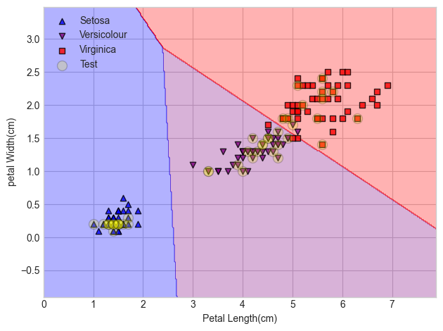
- 더 높은 점수를 위해 GridSearch 적용해보기
import multiprocessing  # cpu 개수만큼 n_jobs를 지정하여 cpu 코어 개수만큼 돌릴 수 있음
from sklearn.model_selection import GridSearchCV

# 로지스틱 회귀의 파라미터 중 penalty 값에 'l1', 'l2', C값에 [2.0, 2.2, 2.4, 2.6, 2.8]을 넣고
# 각각의 경우에 최고의 점수를 추출(총 10번 실행)
param_grid = [{'penalty': ['l1', 'l2'],
               'C': [2.0, 2.2, 2.4, 2.6, 2.8],}]

gs = GridSearchCV(estimator = LogisticRegression(), param_grid = param_grid, scoring = 'accuracy', cv = 10, n_jobs = multiprocessing.cpu_count())

print(gs.best_estimator_)
print("최적 점수: {}".format(gs.best_score_))
print("최적 파라미터: {}".format(gs.best_params_))

# 총 10번의 모델 예측 결과 한번에 확인
pd.DataFrame(result.cv_results_)


# 출력 결과
LogisticRegression(C=2.4)
최적 점수: 0.9800000000000001
최적 파라미터: {'C': 2.4, 'penalty': 'l2'}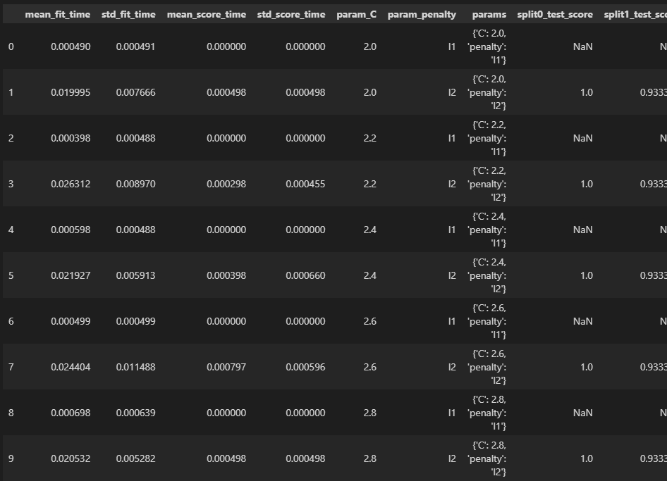
- 유방암 데이터
from sklearn.datasets import load_breast_cancer

cancer = load_breast_cancer()
print(cancer.keys())
print(cancer.DESCR)

# 출력 결과
dict_keys(['data', 'target', 'frame', 'target_names', 'DESCR', 'feature_names', 'filename', 'data_module'])

...

	:Attribute Information:
        - radius (mean of distances from center to points on the perimeter)
        - texture (standard deviation of gray-scale values)
        - perimeter
        - area
        - smoothness (local variation in radius lengths)
        - compactness (perimeter^2 / area - 1.0)
        - concavity (severity of concave portions of the contour)
        - concave points (number of concave portions of the contour)
        - symmetry
        - fractal dimension ("coastline approximation" - 1)

        - class:
                - WDBC-Malignant # 음성
                - WDBC-Benign     # 양성

...- EDA
# 유방암 데이터를 데이터프레임으로 변형
import pandas as pd

cancer_df = pd.DataFrame(cancer.data, columns = cancer.feature_names)
cancer_df['Target'] = cancer.target
# 유방암 데이터 요약(각 변수의 값 개수, 평균, 표준편차 등)
cancer_df.describe()
# 상자그림
fig = plt.figure(figsize = (10, 6))
plt.title('Breast Cancer', fontsize = 15)
plt.boxplot(cancer.data)
plt.xticks(np.arange(30)+1, cancer.feature_names, rotation = 90)
plt.xlabel('Features')
plt.ylabel('Scale')
plt.tight_layout()
- 대부분 아래쪽에 위치하고, mean_area, worst_area에 차이만 좀 두드러짐
- 로지스틱 회귀 적용
from sklearn.linear_model import LogisticRegression
from sklearn.model_selection import train_test_split

X, y = load_breast_cancer(return_X_y = True)
X_train, X_test, y_train, y_test = train_test_split(X, y)

# 몇 번의 반복을 할지 max_iter로 결정(모델을 3000번 돌림)(특성 변수가 많아 많은 횟수 반복 실행)
model = LogisticRegression(max_iter = 3000)
model.fit(X_train, y_train)

print("학습 데이터 점수: {}".format(model.score(X_train, y_train)))
print("평가 데이터 점수: {}".format(model.score(X_test, y_test)))

# 출력 결과
학습 데이터 점수: 0.960093896713615
평가 데이터 점수: 0.951048951048951
● 확률적 경사 하강법(Stochastic Gradient Descent)
- 모델을 학습 시키기 위한 간단한 방법
- 학습 파라미터에 대한 손실 함수의 기울기를 구해 기울기가 최소화 되는 방향으로 학습
$$ \frac{\partial L}{\partial w}=\displaystyle \lim_{h \to 0}\frac{L(w+h)-L(w)}{h} $$
$$ w'=w-\alpha\frac{\partial L}{\partial w} $$
- scikit-learn에서는 선형 SGD와 SGD 분류를 지원
- SGD를 사용한 선형 회귀 분석
# 당뇨병 데이터에 SGDRegressor 적용
from sklearn.linear_model import SGDRegressor
from sklearn.datasets import load_diabetes
from sklearn.model_selection import train_test_split
from sklearn.preprocessing import StandardScaler
from sklearn.pipeline import make_pipeline

X, y = load_diabetes(return_X_y = True)
X_train, X_test, y_train, y_test = train_test_split(X, y)

# 선형 회귀 할 때는 squared_loss를 주로 이용
model = make_pipeline(StandardScaler(), SGDRegressor(loss = 'squared_error'))
model.fit(X_train, y_train)
print("학습 데이터 점수: {}".format(model.score(X_train, y_train)))
print("평가 데이터 점수: {}".format(model.score(X_test, y_test)))

# 출력 결과
학습 데이터 점수: 0.5224282665792391
평가 데이터 점수: 0.4779620860367598

# 모델을 다항 회귀로 사용하였을 때 점수
학습 데이터 점수: 0.6048153298370548
평가 데이터 점수: 0.4242419459459561

# 모델을 직교 정합 추구로 사용하였을 때 점수
학습 데이터 점수: 0.49747193558480873
평가 데이터 점수: 0.5368821270302075

# 모델을 신축망으로 사용하였을 때 점수
학습 데이터 점수: 0.39452567238560965
평가 데이터 점수: 0.34426906645229316

# 모델을 Ridge로 사용하였을 때 점수
학습 데이터 점수: 0.5036670060593883
평가 데이터 점수: 0.5151286628940492

# 모델을 Lasso로 사용하였을 때 점수
학습 데이터 점수: 0.46683101421965556
평가 데이터 점수: 0.5875532568592793

# 모델을 LinearRegression으로 사용하였을 때 점수
학습 데이터 점수: 0.5136038374290528
평가 데이터 점수: 0.5063114437093292
# 붓꽃 데이터에 SGDClassifier 적용
from sklearn.linear_model import SGDClassifier
from sklearn.datasets import load_iris, load_breast_cancer
from sklearn.model_selection import train_test_split
from sklearn.preprocessing import StandardScaler
from sklearn.pipeline import make_pipeline
X, y = load_iris(return_X_y = True)
X_train, X_test, y_train, y_test = train_test_split(X, y)
model = make_pipeline(StandardScaler(), SGDClassifier(loss = 'log'))
model.fit(X_train, y_train)
print("학습 데이터 점수: {}".format(model.score(X_train, y_train)))
print("평가 데이터 점수: {}".format(model.score(X_test, y_test)))
# 출력 결과
학습 데이터 점수: 0.9642857142857143
평가 데이터 점수: 1.0# 유방암 데이터에 SGDClassifier 적용
X, y = load_breast_cancer(return_X_y = True)
X_train, X_test, y_train, y_test = train_test_split(X, y)
model = make_pipeline(StandardScaler(), SGDClassifier(loss = 'log'))
model.fit(X_train, y_train)
print("학습 데이터 점수: {}".format(model.score(X_train, y_train)))
print("평가 데이터 점수: {}".format(model.score(X_test, y_test)))
# 출력 결과
학습 데이터 점수: 0.9882629107981221
평가 데이터 점수: 0.965034965034965'Python > Machine Learning' 카테고리의 다른 글
| [머신러닝 알고리즘] 나이브 베이즈 (0) | 2023.01.10 |
|---|---|
| [머신러닝 알고리즘] K 최근접 이웃 (0) | 2023.01.10 |
| [머신러닝 알고리즘] 선형 회귀(2) (0) | 2023.01.02 |
| [머신러닝 알고리즘] 선형 회귀(1) (0) | 2022.12.29 |
| [머신러닝 알고리즘] 사이킷런 제대로 시작하기(2) (0) | 2022.12.28 |