- 터미널에서 해당 명령어로 counter 폴더에 접근해준뒤 "pc init" 명령어로 pynecone 프로젝트 생성
- counter 폴더 안에 메인 파일인 counter.py가 생성됨
3. counter.py 작성
- 원래의 기본 코드는 다 지우고 counter app을 만들기 위해 기본 틀만 남김
from pcconfig import config
import pynecone as pc

# 각종 상태값을 정의하고 변경하기 위한 State 클래스
class State(pc.State):
    pass

# 앱의 메인
def index():
    return

# 앱 인스턴스 생성
# 페이지 추가
# 컴파일
app = pc.App(state=State)
app.add_page(index)
app.compile()
- pynecone 홈페이지의 코드 작성
from pcconfig import config
import pynecone as pc

# 각종 상태값을 정의하고 변경하기 위한 State 클래스
class State(pc.State):

    # 변수는 모두 State에서 정의
    count = 0

    def increment(self):
        self.count += 1

    def decrement(self):
        self.count -= 1

# 앱의 메인
def index():
    return pc.hstack(
            # 버튼을 클릭했을 때, State에서 정의한 decrement 함수가 실행
            pc.button("desc - 1", on_click = State.decrement, color_scheme = "red", border_radius = "1em"),
            # State에서 정의한 count 변수
            pc.text(State.count),
            # 버튼을 클릭했을 때, State에서 정의한 increment 함수가 실행
            pc.button("asc + 1", on_click = State.increment, color_scheme = "green", border_radius = "1em"),
        )
    )

# 앱 인스턴스 생성
# 페이지 추가
# 컴파일
app = pc.App(state=State)
app.add_page(index)
app.compile()
- 해당 페이지로 실행(pc run을 통해 한 번만 연결해두면 ctrl + s로 저장만 하면 자동으로 서버 재시작됨)
- 추가로 페이지의 중앙에 놓기, ±10 버튼 만들기 연습
from pcconfig import config
import pynecone as pc

# 각종 상태값을 정의하고 변경하기 위한 State 클래스
class State(pc.State):

    # 변수는 모두 State에서 정의
    count = 0

    def increment(self):
        self.count += 1

    def increment_10(self):
        self.count += 10

    def decrement(self):
        self.count -= 1

    def decrement_10(self):
        self.count -= 10

# 앱의 본체에 해당하는 함수(index)
def index():
    return pc.center(
        pc.hstack(
            pc.button("desc - 10", on_click = State.decrement_10, color_scheme = "red", border_radius = "1em"),
            pc.button("desc - 1", on_click = State.decrement, color_scheme = "red", border_radius = "1em"),
            pc.text(State.count),
            pc.button("asc + 1", on_click = State.increment, color_scheme = "green", border_radius = "1em"),
            pc.button("asc + 10", on_click = State.increment_10, color_scheme = "green", border_radius = "1em"),
        ), padding = "50px"
    )

# 앱의 인스턴스 생성
# 페이지 추가
# 컴파일
app = pc.App(state=State)
app.add_page(index)
app.compile()
# my_app이라는 폴더 생성
$ mkdir my_app
# 생성한 my_app 폴더로 현재 위치 이동
$ cd my_app
# 파이썬 가상환경 생성
$ python -m venv venv
# 가상환경 활성화
$ source venv/Scripts/activate
- pynecone 설치, node js 설치
pip install pynecone-io
# node js를 가상환경 별로 사용할 수 있게 해주는 패키지
pip install nodeenv
# 현재 가상환경에 독립된 nodejs 환경 추가
nodeenv -p
# nodejs 버전 잘 나오는지 확인
node -v
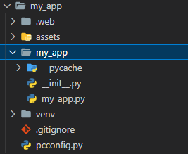
- 여기까지 만들어진 폴더
- 터미널에 "pc init" 명령어로 pynecone 프로젝트를 초기화 시켜주면 다음과 같은 폴더 구조가 생성됨
pc init
- 여기서 my_app.py가 메인 실행 파일
# my_app.py
"""Welcome to Pynecone! This file outlines the steps to create a basic app."""
from pcconfig import config

import pynecone as pc

docs_url = "https://pynecone.io/docs/getting-started/introduction"
filename = f"{config.app_name}/{config.app_name}.py"


class State(pc.State):
    """The app state."""

    pass


def index():
    return pc.center(
        pc.vstack(
            pc.heading("Welcome to Pynecone!", font_size="2em"),
            pc.box("Get started by editing ", pc.code(filename, font_size="1em")),
            pc.link(
                "Check out our docs!",
                href=docs_url,
                border="0.1em solid",
                padding="0.5em",
                border_radius="0.5em",
                _hover={
                    "color": "rgb(107,99,246)",
                },
            ),
            spacing="1.5em",
            font_size="2em",
        ),
        padding_top="10%",
    )


# Add state and page to the app.
app = pc.App(state=State)
app.add_page(index)
app.compile()
- 터미널에 "pc run" 명령어 실행하면 서버 열림
pc run
- localhost:3000을 통해 접속(오류가 뜨기는 하지만 정상)
- my_app.py 파일을 다음과 같이 변경하여 다시 "pc run"을 실행해보면 아래의 페이지가 정상적으로 출력됨
from pcconfig import config
import pynecone as pc

class State(pc.State):
   pass


def index():
    return pc.text("Hello World")

app = pc.App(state=State)
app.add_page(index)
app.compile()
# 필요 라이브러리
import pandas as pd
import numpy as np
import graphviz
import multiprocessing
import matplotlib.pyplot as plt
from sklearn.datasets import load_iris, load_wine, load_breast_cancer, load_diabetes
from sklearn import tree
from sklearn.tree import DecisionTreeClassifier, DecisionTreeRegressor
from sklearn.preprocessing import StandardScaler
from sklearn.model_selection import cross_val_score
from sklearn.pipeline import make_pipeline
1. 결정 트리를 활용한 분류(DecisionTreeClassifier())
DecisionTreeClassifier는 분류를 위한 결정 트리 모델
두 개의 배열 X, y를 입력받음
X는 [n_samples, n_features] 크기의 데이터 특성 배열
y는 [n_samples] 크기의 정답 배열
X = [[0, 0], [1, 1]]
y = [0, 1]

# X가 [0, 0]일 때는 y가 0, X가 [1, 1]일 때는 y가 1 과 같이 분류
model = tree.DecisionTreeClassifier()
model = model.fit(X, y)

# X에 [2, 2]를 줬을 때 0과 1 중 어디로 분류될 지
model.predict([[2., 2.]])

# 출력 결과
array([1]) # 1로 분류됨


# X에 [2, 2]를 줬을 때 0과 1에 각각 분류될 확률
model.predict_proba([[2., 2.]])

# 출력 결과
array([[0., 1.]]) # 1이 선택될 확률이 100%로 나옴
1) 붓꽃 데이터 분류(전처리 x)
model = DecisionTreeClassifier()
cross_val_score(
    estimator = model,
    X = iris.data, y = iris.target,
    cv = 5,
    n_jobs = multiprocessing.cpu_count()
)

# 출력 결과
array([0.96666667, 0.96666667, 0.9       , 1.        , 1.        ])
2) 붓꽃 데이터 분류(전처리 o)
model = make_pipeline(
    StandardScaler(),
    DecisionTreeClassifier()
)

cross_val_score(
    estimator = model,
    X = iris.data, y = iris.target,
    cv = 5,
    n_jobs = multiprocessing.cpu_count()
)

# 출력 결과
array([0.96666667, 0.96666667, 0.9       , 1.        , 1.        ])
- 전처리 한 것과 하지 않은 것의 결과에 차이가 없는데, 결정 트리는 규칙을 학습하기 때문에 전처리에 큰 영향을 받지 않음
X, y = load_diabetes(return_X_y = True)
X_train, X_test, y_train, y_test = train_test_split(X, y, random_state = 42)

model = SVR()
model.fit(X_train, y_train)

print("학습 데이터 점수: {}".format(model.score(X_train, y_train)))
print("평가 데이터 점수: {}".format(model.score(X_test, y_test)))

# 출력 결과
학습 데이터 점수: 0.14990303611569455
평가 데이터 점수: 0.18406447674692128
SVM을 사용한 분류 모델(SVC)
X, y = load_breast_cancer(return_X_y = True)
X_train, X_test, y_train, y_test = train_test_split(X, y, random_state = 42)

model = SVC()
model.fit(X_train, y_train)

print("학습 데이터 점수: {}".format(model.score(X_train, y_train)))
print("평가 데이터 점수: {}".format(model.score(X_test, y_test)))

# 출력 결과
학습 데이터 점수: 0.9107981220657277
평가 데이터 점수: 0.951048951048951
1. 커널 기법
입력 데이터를 고차원 공간에 사상(Mapping)하여 비선형 특징을 학습할 수 있도록 확장
scikit-learn에서는 Linear, Polynomial, RBF(Radial Basis Function) 등 다양한 커널 기법 지원
위의 두 개는 Linear Kernel로, 직선으로 분류
아래는 RBF Kernel과 Polynomial Kernel로 비선형적으로 분류
# SVR에 대해 Linear, Polynomial, RBF Kernel 각각 적용
X, y = load_diabetes(return_X_y = True)
X_train, X_test, y_train, y_test = train_test_split(X, y, random_state = 42)

linear_svr = SVR(kernel = 'linear')
linear_svr.fit(X_train, y_train)

print("Linear SVR 학습 데이터 점수: {}".format(linear_svr.score(X_train, y_train)))
print("Linear SVR 평가 데이터 점수: {}".format(linear_svr.score(X_train, y_train)))

polynomial_svr = SVR(kernel = 'poly')
polynomial_svr.fit(X_train, y_train)

print("Polynomial SVR 학습 데이터 점수: {}".format(polynomial_svr.score(X_train, y_train)))
print("Polynomial SVR 평가 데이터 점수: {}".format(polynomial_svr.score(X_train, y_train)))

rbf_svr = SVR(kernel = 'rbf')
rbf_svr.fit(X_train, y_train)

print("RBF SVR 학습 데이터 점수: {}".format(rbf_svr.score(X_train, y_train)))
print("RBF SVR 평가 데이터 점수: {}".format(rbf_svr.score(X_train, y_train)))

# 출력 결과
Linear SVR 학습 데이터 점수: -0.0029544543016808422
Linear SVR 평가 데이터 점수: -0.0029544543016808422
Polynomial SVR 학습 데이터 점수: 0.26863144203680633
Polynomial SVR 평가 데이터 점수: 0.26863144203680633
RBF SVR 학습 데이터 점수: 0.14990303611569455
RBF SVR 평가 데이터 점수: 0.14990303611569455
# SVC에 대해 Linear, Polynomial, RBF Kernel 각각 적용
X, y = load_breast_cancer(return_X_y = True)
X_train, X_test, y_train, y_test = train_test_split(X, y, random_state = 42)

linear_svr = SVC(kernel = 'linear')
linear_svr.fit(X_train, y_train)

print("Linear SVC 학습 데이터 점수: {}".format(linear_svr.score(X_train, y_train)))
print("Linear SVC 평가 데이터 점수: {}".format(linear_svr.score(X_train, y_train)))

polynomial_svr = SVC(kernel = 'poly')
polynomial_svr.fit(X_train, y_train)

print("Polynomial SVC 학습 데이터 점수: {}".format(polynomial_svr.score(X_train, y_train)))
print("Polynomial SVC 평가 데이터 점수: {}".format(polynomial_svr.score(X_train, y_train)))

rbf_svr = SVC(kernel = 'rbf')
rbf_svr.fit(X_train, y_train)

print("RBF SVC 학습 데이터 점수: {}".format(rbf_svr.score(X_train, y_train)))
print("RBF SVC 평가 데이터 점수: {}".format(rbf_svr.score(X_train, y_train)))

# 출력 결과
Linear SVC 학습 데이터 점수: 0.9694835680751174
Linear SVC 평가 데이터 점수: 0.9694835680751174
Polynomial SVC 학습 데이터 점수: 0.8990610328638498
Polynomial SVC 평가 데이터 점수: 0.8990610328638498
RBF SVC 학습 데이터 점수: 0.9107981220657277
RBF SVC 평가 데이터 점수: 0.9107981220657277
2. 매개변수 튜닝
SVM은 사용하는 Kernel에 따라 다양한 매개변수 설정 가능
매개변수를 변경하면서 성능 변화를 관찰
# SVC의 Polynomial Kernel 설정에서 매개변수를 더 변경
X, y = load_breast_cancer(return_X_y = True)
X_train, X_test, y_train, y_test = train_test_split(X, y, random_state = 42)

polynomial_svr = SVC(kernel = 'poly', degree = 2, C = 0.1, gamma = 'auto')
polynomial_svr.fit(X_train, y_train)

print("Polynomial SVC 학습 데이터 점수: {}".format(polynomial_svr.score(X_train, y_train)))
print("Polynomial SVC 평가 데이터 점수: {}".format(polynomial_svr.score(X_train, y_train)))

# 출력 결과
Polynomial SVC 학습 데이터 점수: 0.9765258215962441
Polynomial SVC 평가 데이터 점수: 0.9765258215962441


# SVC의 RBF Kernel 설정에서 매개변수를 더 변경
rbf_svr = SVC(kernel = 'rbf', C = 2.0, gamma = 'scale')
rbf_svr.fit(X_train, y_train)

print("RBF SVC 학습 데이터 점수: {}".format(rbf_svr.score(X_train, y_train)))
print("RBF SVC 평가 데이터 점수: {}".format(rbf_svr.score(X_train, y_train)))

# 출력 결과
RBF SVC 학습 데이터 점수: 0.9131455399061033
RBF SVC 평가 데이터 점수: 0.9131455399061033
위에서 기본 매개변수로만 돌렸을 때 0.89정도로 나왔던 점수보다 더 높은 점수로, 매개변수를 조작함에 따라 성능이 더 높아짐을 확인
3. 데이터 전처리
SVM은 입력 데이터가 정규화 되어야 좋은 성능을 보임
주로 모든 특성 값의 범위를 [0, 1]로 맞추는 방법 사용
scikit-learn의 StandardScaler 또는 MinMaxScaler 사용해 정규화
X, y = load_breast_cancer(return_X_y = True)
X_train, X_test, y_train, y_test = train_test_split(X, y, random_state = 42)

# 스케일링 이전 데이터
model = SVC()
model.fit(X_train, y_train)

print("SVC 학습 데이터 점수: {}".format(model.score(X_train, y_train)))
print("SVC 평가 데이터 점수: {}".format(model.score(X_test, y_test)))

# 출력 결과
SVC 학습 데이터 점수: 0.9107981220657277
SVC 평가 데이터 점수: 0.951048951048951


# 스케일링 이후 데이터
scaler = StandardScaler()
X_train = scaler.fit_transform(X_train)
X_test = scaler.transform(X_test)

model.fit(X_train, y_train)

print("SVC 학습 데이터 점수: {}".format(model.score(X_train, y_train)))
print("SVC 평가 데이터 점수: {}".format(model.score(X_test, y_test)))

# 출력 결과
SVC 학습 데이터 점수: 0.9882629107981221
SVC 평가 데이터 점수: 0.972027972027972
4. 당뇨병 데이터로 SVR(커널은 기본값('linear')로) 실습
- 가장 기본 모델
# 데이터 불러오기
X, y = load_diabetes(return_X_y = True)

# 학습 / 평가 데이터 분리
X_train, X_test, y_train, y_test = train_test_split(X, y, test_size = 0.2)

# 범위 [0, 1]로 정규화
scaler = StandardScaler()
X_train = scaler.fit_transform(X_train)
X_test = scaler.transform(X_test)

# 선형 SVR 모델에 피팅
model = SVR(kernel = 'linear')
model.fit(X_train, y_train)

# 점수 출력
print("SVR 학습 데이터 점수: {}".format(model.score(X_train, y_train)))
print("SVR 평가 데이터 점수: {}".format(model.score(X_test, y_test)))

# 출력 결과
SVR 학습 데이터 점수: 0.5114667038352527
SVR 평가 데이터 점수: 0.45041670810045853
# 하이퍼 파라미터에 kernel을 넣어 어떤 kernel이 가장 좋은 지 판단
pipe = Pipeline([('scaler', StandardScaler()),
                 ('model', SVR(kernel = 'rbf'))])

param_grid = [{'model__kernel': ['rbf', 'poly', 'sigmoid']}]

gs = GridSearchCV(
    estimator = pipe,
    param_grid = param_grid,
    n_jobs = multiprocessing.cpu_count(),
    cv = 5,
    verbose = True
)
gs.fit(X, y)
gs.best_estimator_
# sigmoid가 가장 좋은 예측을 하는 것으로 나옴
# 커널은 sigmoid로 하고 나머지 하이퍼 파라미터 중 어떤 게 좋은지 GridSearch 실행
pipe = Pipeline([('scaler', StandardScaler()),
                 ('model', SVR(kernel = 'sigmoid'))])

param_grid = [{'model__gamma': ['scale', 'auto'],
               'model__C': [1.0, 0.1, 0.01],
               'model__epsilon': [1.0, 0.1, 0.01]}]

gs = GridSearchCV(
    estimator = pipe,
    param_grid = param_grid,
    n_jobs = multiprocessing.cpu_count(),
    cv = 5,
    verbose = True
)
gs.fit(X, y)
gs.best_estimator_

# epsilon이 1.0, gamma는 auto일 때 가장 좋음
- 최종 sigmoid를 사용한 점수
model = gs.best_estimator_
model.fit(X_train, y_train)

print("학습 데이터 점수: {}".format(model.score(X_train, y_train)))
print("평가 데이터 점수: {}".format(model.score(X_test, y_test)))

# 출력 결과
학습 데이터 점수: 0.3649291208855052
평가 데이터 점수: 0.39002165443861103
6. 유방암 데이터로 SVC(커널은 기본값('linear')로) 실습
X, y = load_breast_cancer(return_X_y = True)
X_train, X_test, y_train, y_test = train_test_split(X, y, test_size = 0.2)

scaler = StandardScaler()
scaler.fit(X_train)
X_train = scaler.fit_transform(X_train)
X_test = scaler.transform(X_test)

model = SVC(kernel = 'linear')
model.fit(X_train, y_train)

print("학습 데이터 점수: {}".format(model.score(X_train, y_train)))
print("평가 데이터 점수: {}".format(model.score(X_test, y_test)))

# 출력 결과
학습 데이터 점수: 0.9846153846153847
평가 데이터 점수: 1.0
- 이미 잘 나오긴 함
- 시각화
def make_meshgrid(x, y, h = 0.02):
    x_min, x_max = x.min()-1, x.max()+1
    y_min, y_max = y.min()-1, y.max()+1
    xx, yy = np.meshgrid(np.arange(x_min, x_max, h),
                         np.arange(y_min, y_max, h))

    return xx, yy

def plot_contour(clf, xx, yy, **params):
    Z = clf.predict(np.c_[xx.ravel(), yy.ravel()])
    Z = Z.reshape(xx.shape)
    out = plt.contourf(xx, yy, Z, **params)
    return out

X_comp = TSNE(n_components = 2).fit_transform(X)
X0, X1 = X_comp[:, 0], X_comp[:, 1]
xx, yy = make_meshgrid(X0, X1)

model.fit(X_comp, y)

plot_contour(model, xx, yy, cmap = plt.cm.coolwarm, alpha = 0.7)
plt.scatter(X0, X1, c = y, cmap = plt.cm.coolwarm, s = 20, edgecolors = 'k')
- 거의 대부분 같은 색으로 맞춘 모습
# 교차 검증
estimator = make_pipeline(StandardScaler(), SVC(kernel = 'linear'))

cross_validate(
    estimator = estimator,
    X = X, y = y,
    cv = 5,
    n_jobs = multiprocessing.cpu_count(),
    verbose = True
)

# 출력 결과
[Parallel(n_jobs=8)]: Using backend LokyBackend with 8 concurrent workers.
[Parallel(n_jobs=8)]: Done   2 out of   5 | elapsed:    1.5s remaining:    2.3s
[Parallel(n_jobs=8)]: Done   5 out of   5 | elapsed:    1.5s finished
{'fit_time': array([0.00498796, 0.00498223, 0.00598669, 0.00300407, 0.00298858]),
 'score_time': array([0.00199056, 0.00099754, 0.00099754, 0.00091267, 0.00099921]),
 'test_score': array([0.96491228, 0.98245614, 0.96491228, 0.96491228, 0.98230088])}
model = gs.best_estimator_
model.fit(X_train, y_train)

print("학습 데이터 점수: {}".format(model.score(X_train, y_train)))
print("평가 데이터 점수: {}".format(model.score(X_test, y_test)))

# 출력 결과
학습 데이터 점수: 0.978021978021978
평가 데이터 점수: 1.0
7. 유방암 데이터로 SVC(커널 변경) 실습
X, y = load_breast_cancer(return_X_y = True)
X_train, X_test, y_train, y_test = train_test_split(X, y, test_size = 0.2)

scaler = StandardScaler()
scaler.fit(X_train)
X_train = scaler.fit_transform(X_train)
X_test = scaler.transform(X_test)

model = SVC(kernel = 'rbf')
model.fit(X_train, y_train)

print("학습 데이터 점수: {}".format(model.score(X_train, y_train)))
print("평가 데이터 점수: {}".format(model.score(X_test, y_test)))

# 출력 결과
학습 데이터 점수: 0.989010989010989
평가 데이터 점수: 0.9385964912280702
def make_meshgrid(x, y, h = 0.02):
    x_min, x_max = x.min()-1, x.max()+1
    y_min, y_max = y.min()-1, y.max()+1
    xx, yy = np.meshgrid(np.arange(x_min, x_max, h),
                         np.arange(y_min, y_max, h))

    return xx, yy

def plot_contour(clf, xx, yy, **params):
    Z = clf.predict(np.c_[xx.ravel(), yy.ravel()])
    Z = Z.reshape(xx.shape)
    out = plt.contourf(xx, yy, Z, **params)
    return out

X_comp = TSNE(n_components = 2).fit_transform(X)
X0, X1 = X_comp[:, 0], X_comp[:, 1]
xx, yy = make_meshgrid(X0, X1)

model.fit(X_comp, y)

plot_contour(model, xx, yy, cmap = plt.cm.coolwarm, alpha = 0.7)
plt.scatter(X0, X1, c = y, cmap = plt.cm.coolwarm, s = 20, edgecolors = 'k')
- 커널이 linear일 때처럼 선형으로 나눠지지 않고 곡선으로 나눠짐
# 교차 검증
estimator = make_pipeline(StandardScaler(), SVC(kernel = 'rbf'))

cross_validate(
    estimator = estimator,
    X = X, y = y,
    cv = 5,
    n_jobs = multiprocessing.cpu_count(),
    verbose = True
)

# 출력 결과
[Parallel(n_jobs=8)]: Using backend LokyBackend with 8 concurrent workers.
[Parallel(n_jobs=8)]: Done   2 out of   5 | elapsed:    1.6s remaining:    2.5s
[Parallel(n_jobs=8)]: Done   5 out of   5 | elapsed:    1.6s finished
{'fit_time': array([0.0039866 , 0.00697613, 0.00698733, 0.0039866 , 0.00399065]),
 'score_time': array([0.00299096, 0.00299168, 0.00397682, 0.00300074, 0.0019927 ]),
 'test_score': array([0.97368421, 0.95614035, 1.        , 0.96491228, 0.97345133])}
# GridSearch
pipe = Pipeline([('scaler', StandardScaler()),
                 ('model', SVC())])

param_grid = [{'model__kernel': ['rbf', 'poly', 'sigmoid']}]

gs = GridSearchCV(
    estimator = pipe,
    param_grid = param_grid,
    n_jobs = multiprocessing.cpu_count(),
    cv = 5,
    verbose = True
)
gs.fit(X, y)
gs.best_params_

# 출력 결과
{'model__kernel': 'rbf'}
# kernel이 rbf일 때 가장 좋은 성능
model = gs.best_estimator_
model.fit(X_train, y_train)

print("학습 데이터 점수: {}".format(model.score(X_train, y_train)))
print("평가 데이터 점수: {}".format(model.score(X_test, y_test)))

# 출력 결과
학습 데이터 점수: 0.9372487007252107
평가 데이터 점수: 0.8063011852114969
# 계산 원리
# p(C_k) 부분
prior = [0.45, 0.3, 0.15, 0.1]

# 가능성(확률)
likelihood = [[0.3, 0.3, 0.4], [0.7, 0.2, 0.1], [0.15, 0.5, 0.35], [0.6, 0.2, 0.2]]

# 각 prior에 대한 가능성의 계산을 합한 결과
idx = 0
for c, xs in zip(prior, likelihood):
    result = 1
    for x in xs:
        result *=x
    result *= c

    idx += 1
    print(f"{idx}번째 클래스의 가능성: {result}")

# 출력 결과
# 0.3 * 0.3 * 0.4 * 0.45
1번째 클래스의 가능성: 0.0162
# 0.7 * 0.2 * 0.1 * 0.3
2번째 클래스의 가능성: 0.0042
# 0.15 * 0.5 * 0.35 * 0.15
3번째 클래스의 가능성: 0.0039375
# 0.6 * 0.2 * 0.2 * 0.1
4번째 클래스의 가능성: 0.0024000000000000002
1) 산림 토양 데이터
import numpy as np
import pandas as pd
from sklearn.naive_bayes import GaussianNB, BernoulliNB, MultinomialNB
from sklearn.datasets import fetch_covtype, fetch_20newsgroups
from sklearn.model_selection import train_test_split
from sklearn.preprocessing import StandardScaler
from sklearn.feature_extraction.text import CountVectorizer, HashingVectorizer, TfidfVectorizer
from sklearn import metrics
covtype = fetch_covtype()
print(covtype.DESCR)

# 출력 결과

...

**Data Set Characteristics:**

    =================   ============
    Classes                        7  # 7개의 토양 클래스
    Samples total             581012
    Dimensionality                54  # 특성 변수 54개
    Features                     int
    =================   ============

...
# 학습, 평가 데이터 분류
covtype_X = covtype.data
covtype_y = covtype.target
covtype_X_train, covtype_X_test, covtype_y_train, covtype_y_test = train_test_split(covtype_X, covtype_y, test_size = 0.2)

print("전체 데이터 크기: {}".format(covtype_X.shape))
print("학습 데이터 크기: {}".format(covtype_X_train.shape))
print("평가 데이터 크기: {}".format(covtype_X_test.shape))

# 출력 결과
전체 데이터 크기: (581012, 54)
학습 데이터 크기: (464809, 54)
평가 데이터 크기: (116203, 54)
model = GaussianNB()
model.fit(covtype_X_train_scale, covtype_y_train)

# train 데이터
predict = model.predict(covtype_X_train_scale)
acc = metrics.accuracy_score(covtype_y_train, predict)
f1 = metrics.f1_score(covtype_y_train, predict, average = None)

print("Accuracy: {}".format(acc))
print("F1 score: {}".format(f1))

# 출력 결과
Accuracy: 0.0879328928656717
F1 score: [0.0400872  0.0179923  0.33471803 0.1384795  0.04347626 0.07084596
 0.23590156]


 # test 데이터
 predict = model.predict(covtype_X_test_scale)
acc = metrics.accuracy_score(covtype_y_test, predict)
f1 = metrics.f1_score(covtype_y_test, predict, average = None)

print("Test Accuracy: {}".format(acc))
print("Test F1 score: {}".format(f1))

# 출력 결과
Test Accuracy: 0.08831957866836485
Test F1 score: [0.04190772 0.01778446 0.33599527 0.13787086 0.04217007 0.06545961
 0.23676243]
# 시각화(데이터가 크므로 make_blobs로 임의의 데이터 만들어서 연습)
import matplotlib.pyplot as plt
from sklearn.datasets import make_blobs

def make_meshgrid(x, y, h = .02):
    x_min, x_max = x.min()-1, x.max()+1
    y_min, y_max = y.min()-1, y.max()+1
    xx, yy = np.meshgrid(np.arange(x_min, x_max, h),
                         np.arange(y_min, y_max, h))
    return xx, yy

def plot_contours(clf, xx, yy, **params):
    Z = clf.predict(np.c_[xx.ravel(), yy.ravel()])
    Z = Z.reshape(xx.shape)
    out = plt.contourf(xx, yy, Z, **params)
    return out

X, y = make_blobs(n_samples = 1000)
plt.scatter(X[:, 0], X[:, 1], c = y, cmap = plt.cm.coolwarm, s = 20, edgecolors = 'k')
model = GaussianNB()
model.fit(X, y)

xx, yy = make_meshgrid(X[:, 0], X[:, 1])
plot_contours(model, xx, yy, cmap = plt.cm.coolwarm, alpha = 0.8)
plt.scatter(X[:, 0], X[:, 1], c = y, cmap = plt.cm.coolwarm, s = 20, edgecolors = 'k')
# 시각화(실제 토양 데이터)
plt.scatter(covtype_X[:, 0], covtype_X[:, 1], c = covtype_y, cmap = plt.cm.coolwarm, s = 20, edgecolors = 'k')
2) 뉴스 데이터
newsgroup = fetch_20newsgroups()
print(newsgroup.DESCR)

# 출력 결과

...

**Data Set Characteristics:**

    =================   ==========
    Classes                     20  # 20개의 클래스
    Samples total            18846
    Dimensionality               1  # 변수가 1개
    Features                  text
    =================   ==========

...
# 학습, 평가 데이터 분류
newsgroup_train = fetch_20newsgroups(subset = 'train')
newsgroup_test = fetch_20newsgroups(subset = 'test')

X_train, y_train = newsgroup_train.data, newsgroup_train.target
X_test, y_test = newsgroup_test.data, newsgroup_test.target
- 벡터화
텍스트 데이터는 기계학습 모델에 입력할 수 없음
벡터화는 텍스트 데이터를 실수 벡터로 변환해 기계학습 모델에 입력할 수 있도록 하는 전처리 과정
scikit-learn에서는 Count, Tf-idf, Hashing 세가지 방법 지원
- CounterVectorize
가장 간단한 형태
문서에 나온 단어의 수를 세서 벡터 생성
count_vectorizer = CountVectorizer()
X_train_count = count_vectorizer.fit_transform(X_train)
X_test_count = count_vectorizer.transform(X_test)

# 데이터를 희소 행렬(sparce matrix) 형태로 표현
X_train_count

# 출력 결과
<11314x130107 sparse matrix of type '<class 'numpy.int64'>'
	with 1787565 stored elements in Compressed Sparse Row format>
# 첫번째 데이터에 대해 각 단어의 개수 출력
for v in X_train_count[0]:
    print(v)
- HashingVectorizer
각 단어를 해쉬 값으로 표현
미리 정해진 크기의 벡터로 표현
# 제한된 크기(n_features)의 벡터를 가짐
hash_vectorizer = HashingVectorizer(n_features = 1000)
X_train_hash = hash_vectorizer.fit_transform(X_train)
X_test_hash = hash_vectorizer.transform(X_test)

# 마찬가지로 희소 행렬 형태
X_train_hash

# 출력 결과
<11314x1000 sparse matrix of type '<class 'numpy.float64'>'
	with 1550687 stored elements in Compressed Sparse Row format>
# 해쉬값 형태로 출력됨
for v in X_train_hash[0]:
    print(v)
- TfIdfVectorizer
문서에 나온 단어 빈도(term frequency)와 역문서 빈도(inverse document frequency)를 곱해서 구함
각 빈도는 일반적으로 로그 스케일링 후 사용
\( tf(t, d)=log(f(t,d)+1) \)
\( idf(t, D)=\frac{|D|}{|d\in D:t \in d|+1} \)
\( tfidf(t, d, D)=tf(t, d) \times idf(t, D) \)
tfidf_vectorizer = TfidfVectorizer()
X_train_tfidf = tfidf_vectorizer.fit_transform(X_train)
X_test_tfidf = tfidf_vectorizer.transform(X_test)

X_train_tfidf

# 출력 결과
<11314x130107 sparse matrix of type '<class 'numpy.float64'>'
	with 1787565 stored elements in Compressed Sparse Row format>
# Tf-Idf 값으로 출력
for v in X_train_tfidf[0]:
    print(v)
- 베르누이 나이브 베이즈: 입력 특성이 베르누이 분포에 의해 생성된 이진 값을 갖는다고 가정
model = BernoulliNB()

# CountVextorizer로 벡터화한 모델
model.fit(X_train_count, y_train)

# 훈련 데이터
model = BernoulliNB()
model.fit(X_train_count, y_train)

# 출력 결과
Train Accuracy: 0.7821283365741559
Train F1 score: [0.80096502 0.8538398  0.13858268 0.70686337 0.85220126 0.87944493
 0.51627694 0.84532672 0.89064976 0.87179487 0.94561404 0.91331546
 0.84627832 0.89825848 0.9047619  0.79242424 0.84693878 0.84489796
 0.67329545 0.14742015]


 # 테스트 데이터
predict = model.predict(X_test_count)
acc = metrics.accuracy_score(y_test, predict)
f1 = metrics.f1_score(y_test, predict, average = None)

print("Test Accuracy: {}".format(acc))
print("Test F1 score: {}".format(f1))

# 출력 결과
Test Accuracy: 0.6307753584705258
Test F1 score: [0.47086247 0.60643564 0.01       0.56014047 0.6953405  0.70381232
 0.44829721 0.71878646 0.81797753 0.81893491 0.90287278 0.74794521
 0.61647059 0.64174455 0.76967096 0.63555114 0.64285714 0.77971474
 0.31382979 0.00793651]
# HashingVectorizer로 벡터화한 모델
model.fit(X_train_hash, y_train)

# 훈련 데이터
predict = model.predict(X_train_hash)
acc = metrics.accuracy_score(y_train, predict)
f1 = metrics.f1_score(y_train, predict, average = None)

print("Train Accuracy: {}".format(acc))
print("Train F1 score: {}".format(f1))

# 출력 결과
Train Accuracy: 0.5951917977726711
Train F1 score: [0.74226804 0.49415205 0.45039019 0.59878155 0.57327935 0.63929619
 0.35390947 0.59851301 0.72695347 0.68123862 0.79809524 0.70532319
 0.54703833 0.66862745 0.61889927 0.74707471 0.6518668  0.60485269
 0.5324165  0.54576271]


# 테스트 데이터
predict = model.predict(X_test_hash)
acc = metrics.accuracy_score(y_test, predict)
f1 = metrics.f1_score(y_test, predict, average = None)

print("Test Accuracy: {}".format(acc))
print("Test F1 score: {}".format(f1))

# 출력 결과
Test Accuracy: 0.4430430164630908
Test F1 score: [0.46678636 0.33826638 0.29391892 0.45743329 0.41939121 0.46540881
 0.34440068 0.46464646 0.62849873 0.53038674 0.63782051 0.55251799
 0.32635983 0.34266886 0.46105919 0.61780105 0.46197991 0.54591837
 0.27513228 0.3307888 ]
# TfIdfVectorizer로 벡터화한 모델
model.fit(X_train_tfidf, y_train)

# 훈련 데이터
predict = model.predict(X_train_tfidf)
acc = metrics.accuracy_score(y_train, predict)
f1 = metrics.f1_score(y_train, predict, average = None)

print("Train Accuracy: {}".format(acc))
print("Train F1 score: {}".format(f1))

# 출력 결과
Train Accuracy: 0.7821283365741559
Train F1 score: [0.80096502 0.8538398  0.13858268 0.70686337 0.85220126 0.87944493
 0.51627694 0.84532672 0.89064976 0.87179487 0.94561404 0.91331546
 0.84627832 0.89825848 0.9047619  0.79242424 0.84693878 0.84489796
 0.67329545 0.14742015]


# 테스트 데이터
predict = model.predict(X_test_tfidf)
acc = metrics.accuracy_score(y_test, predict)
f1 = metrics.f1_score(y_test, predict, average = None)

print("Test Accuracy: {}".format(acc))
print("Test F1 score: {}".format(f1))

# 출력 결과
Test Accuracy: 0.6307753584705258
Test F1 score: [0.47086247 0.60643564 0.01       0.56014047 0.6953405  0.70381232
 0.44829721 0.71878646 0.81797753 0.81893491 0.90287278 0.74794521
 0.61647059 0.64174455 0.76967096 0.63555114 0.64285714 0.77971474
 0.31382979 0.00793651]
- 시각화
# 시각화(데이터가 크므로 make_blobs로 임의의 데이터 만들어서 연습)
X, y = make_blobs(n_samples = 1000)
plt.scatter(X[:, 0], X[:, 1], c = y, cmap = plt.cm.coolwarm, s = 20, edgecolors = 'k')
model = BernoulliNB()
model.fit(X, y)

xx, yy = make_meshgrid(X[:, 0], X[:, 1])
plot_contours(model, xx, yy, cmap = plt.cm.coolwarm, s = 20, edgecolors = 'k')
plt.scatter(X[:, 0], X[:, 1], c = y, cmap = plt.cm.coolwarm, s = 20, edgecolors = 'k')
- 다항 나이브 베이즈: 입력 특성이 다항분포에 의해 생성된 빈도수 값을 갖는다고 가정
model = MultinomialNB()

# CountVectorizer로 벡터화한 모델
model.fit(X_train_count, y_train)

# 훈련 데이터
predict = model.predict(X_train_count)
acc = metrics.accuracy_score(y_train, predict)
f1 = metrics.f1_score(y_train, predict, average = None)

print("Train Accuracy: {}".format(acc))
print("Train F1 Score: {}".format(f1))

# 출력 결과
Train Accuracy: 0.9245182959165635
Train F1 Score: [0.95228426 0.904      0.25073746 0.81402003 0.96669513 0.88350983
 0.90710383 0.97014925 0.98567818 0.99325464 0.98423237 0.95399516
 0.95703454 0.98319328 0.98584513 0.95352564 0.97307002 0.97467249
 0.95157895 0.86526946]


# 테스트 데이터
predict = model.predict(X_test_count)
acc = metrics.accuracy_score(y_test, predict)
f1 = metrics.f1_score(y_test, predict, average = None)

print("Test Accuracy: {}".format(acc))
print("Test F1 Score: {}".format(f1))

# 출력 결과
Test Accuracy: 0.7728359001593202
Test F1 Score: [0.77901431 0.7008547  0.00501253 0.64516129 0.79178082 0.73370166
 0.76550681 0.88779285 0.93951094 0.91390728 0.94594595 0.78459938
 0.72299169 0.84635417 0.86029412 0.80846561 0.78665077 0.89281211
 0.60465116 0.48695652]
# TdIdfVectorizer로 벡터화한 모델
model.fit(X_train_tfidf, y_train)

# 훈련 데이터
predict = model.predict(X_train_tfidf)
acc = metrics.accuracy_score(y_train, predict)
f1 = metrics.f1_score(y_train, predict, average = None)

print("Train Accuracy: {}".format(acc))
print("Train F1 Score: {}".format(f1))

# 출력 결과
Train Accuracy: 0.9326498143892522
Train F1 Score: [0.87404162 0.95414462 0.95726496 0.92863002 0.97812773 0.97440273
 0.91090909 0.97261411 0.98659966 0.98575021 0.98026316 0.94033413
 0.9594478  0.98032506 0.97755611 0.77411003 0.93506494 0.97453907
 0.90163934 0.45081967]


# 테스트 데이터
predict = model.predict(X_test_tfidf)
acc = metrics.accuracy_score(y_test, predict)
f1 = metrics.f1_score(y_test, predict, average = None)

print("Test Accuracy: {}".format(acc))
print("Test F1 Score: {}".format(f1))

# 출력 결과
Test Accuracy: 0.7738980350504514
Test F1 Score: [0.63117871 0.72       0.72778561 0.72104019 0.81309686 0.81643836
 0.7958884  0.88135593 0.93450882 0.91071429 0.92917167 0.73583093
 0.69732938 0.81907433 0.86559803 0.60728118 0.76286353 0.92225201
 0.57977528 0.24390244]
- 시각화
# 시각화(데이터가 크므로 make_blobs로 임의의 데이터 만들어서 연습)
from sklearn.preprocessing import MinMaxScaler
X, y = make_blobs(n_samples = 1000)
scaler = MinMaxScaler()
X = scaler.fit_transform(X)
plt.scatter(X[:, 0], X[:, 1], c = y, cmap = plt.cm.coolwarm, s = 20, edgecolors = 'k')
model = MultinomialNB()
model.fit(X, y)

xx, yy = make_meshgrid(X[:, 0], X[:, 1])
plot_contours(model, xx, yy, cmap = plt.cm.coolwarm, s = 20, edgecolors = 'k')
plt.scatter(X[:, 0], X[:, 1], c = y, cmap = plt.cm.coolwarm, s = 20, edgecolors = 'k')
import pandas as pd
import numpy as np
import multiprocessing
import matplotlib.pyplot as plt
plt.style.use(['seaborn-whitegrid'])

from sklearn.neighbors import KNeighborsClassifier, KNeighborsRegressor

# 시각화용
from sklearn.manifold import TSNE
# 사용할 예제 데이터세트
from sklearn.datasets import load_iris, load_breast_cancer, load_diabetes, fetch_california_housing

from sklearn.model_selection import train_test_split, cross_validate, GridSearchCV
from sklearn.preprocessing import StandardScaler
from sklearn.pipeline import make_pipeline
1. K 최근접 이웃(분류)
입력 데이터 포인트와 가장 가까운 k개의 훈련 데이터 포인트가 출력
k개의 데이터 포인트 중 가장 많은 클래스가 예측 결과로 도출됨
1) 붓꽃 데이터
# 데이터 불러오기
X, y = load_iris(return_X_y = True)

# 훈련 데이터와 검증 데이터로 분리
X_train, X_test, y_train, y_test = train_test_split(X, y, test_size = 0.2)

# 범위 스케일링
scaler = StandardScaler()
X_train_scale = scaler.fit_transform(X_train)
X_test_scale = scaler.transform(X_test)

# K 최근접 이웃 모델 생성 후 학습(스케일링 하지 않은 모델로 학습)
model = KNeighborsClassifier()
model.fit(X_train, y_train)

print("학습 데이터 점수: {}".format(model.score(X_train, y_train)))
print("평가 데이터 점수: {}".format(model.score(X_test, y_test)))

# 출력 결과
학습 데이터 점수: 0.9666666666666667
평가 데이터 점수: 1.0


# K 최근접 이웃 모델 생성 후 학습(스케일링 한 모델로 학습)
model = KNeighborsClassifier()
model.fit(X_train_scaled, y_train)

print("학습 데이터 점수: {}".format(model.score(X_train_scaled, y_train)))
print("평가 데이터 점수: {}".format(model.score(X_test_scaled, y_test)))

# 출력 결과
학습 데이터 점수: 0.95
평가 데이터 점수: 1.0
- 교차검증으로 검증해주기
cross_validate(
    estimator = KNeighborsClassifier(),
    X = X, y = y,
    cv = 5,
    # cpu 코어 개수만큼 실행
    n_jobs = multiprocessing.cpu_count(),
    # 설명 출력
    verbose = True
)

# 출력 결과
[Parallel(n_jobs=8)]: Using backend LokyBackend with 8 concurrent workers.
[Parallel(n_jobs=8)]: Done   2 out of   5 | elapsed:    1.6s remaining:    2.5s
[Parallel(n_jobs=8)]: Done   5 out of   5 | elapsed:    1.7s finished
{'fit_time': array([0.00099683, 0.0009973 , 0.00099683, 0.00099564, 0.        ]),
 'score_time': array([0.00298977, 0.00199294, 0.00298977, 0.00299048, 0.00099659]),
 'test_score': array([0.96666667, 1.        , 0.93333333, 0.96666667, 1.        ])}
- 최적화(하이퍼 파라미터 조정)
param_grid = [{'n_neighbors': [3, 5, 7], # 이웃 생성 개수
               'weights': ['uniform', 'distance'], # 가중치 주는 방식(빈번하게 쓰는 건 distance)
               'algorithm': ['ball_tree', 'kd_tree', 'brute']}]

# 그리드 서치 옵션 설정
gs = GridSearchCV(
    estimator = KNeighborsClassifier(),
    param_grid = param_grid,
    n_jobs = multiprocessing.cpu_count(),
    verbose = True
)

gs.fit(X, y)
gs.best_estimator_
설정해준 param_grid에서 ball_tree 알고리즘, 이웃 개수는 7개가 선택됨
print('GridSearchCV best score: {}'.format(gs.best_score_))

# 출력 결과
GridSearchCV best score: 0.9800000000000001
# 위의 파라미터가 적용되었을 때 나온 최고의 점수는 약 0.98
- 시각화
# 격자 만드는 함수
def make_meshgrid(x, y, h = 0.02):
    x_min, x_max = x.min()-1, x.max()+1
    y_min, y_max = y.min()-1, y.max()+1
    xx, yy = np.meshgrid(np.arange(x_min, x_max, h),
                         np.arange(y_min, y_max, h))

    return xx, yy

# 격자 형태의 데이터를 예측 모델에 넣어서 각 격자점의 예측값을 구하고 나중에 예측값 별로 색깔 다르게 해서 해당 값의 범위 시각화
def plot_contours(clf, xx, yy, **params):
    Z = clf.predict(np.c_[xx.ravel(), yy.ravel()])
    Z = Z.reshape(xx.shape)
    out = plt.contourf(xx, yy, Z, **params)

    return out

# 요소를 두 개로 만들어 저차원으로 변환
tsne = TSNE(n_components = 2)
X_comp = tsne.fit_transform(X)

iris_comp_df = pd.DataFrame(data = X_comp)
iris_comp_df['Target'] = y
iris_comp_df
두 개의 요소로 바뀐 데이터
plt.scatter(X_comp[:, 0], X_comp[:, 1],
            c = y, cmap = plt.cm.coolwarm, s = 20, edgecolors = 'k')
각 이웃별로 색깔이 구분되어 시각화
model = KNeighborsClassifier()
model.fit(X_comp, y)
predict = model.predict(X_comp)

xx, yy = make_meshgrid(X_comp[:, 0], X_comp[:, 1])
plot_contours(model, xx, yy, cmap = plt.cm.coolwarm, alpha = 0.8)
plt.scatter(X_comp[:, 0], X_comp[:, 1], c = y, cmap = plt.cm.coolwarm, s = 20, edgecolors = 'k')
격자로 만든 데이터도 모델에 넣어 예측값을 구하고 예측값에 따라 색깔을 부여하고 각 이웃별 영역 표시
각 데이터의 위치가 색깔 영역 내에 있으면 해당 색깔로 분류됨
2) 유방암 데이터
cancer = load_breast_cancer()
X, y = cancer.data, cancer.target
X_train, X_test, y_train, y_test = train_test_split(X, y, test_size = 0.2)


# 스케일링 하지 않은 데이터에 대한 예측 결과
model = KNeighborsClassifier()
model.fit(X_train, y_train)

print("학습 데이터 점수: {}".format(model.score(X_train, y_train)))
print("평가 데이터 점수: {}".format(model.score(X_test, y_test)))

# 출력 결과
학습 데이터 점수: 0.9472527472527472
평가 데이터 점수: 0.8947368421052632


# 스케일링 한 데이터에 대한 예측 결과
scaler = StandardScaler()
X_train_scale = scaler.fit_transform(X_train)
X_test_scale = scaler.transform(X_test)

model = KNeighborsClassifier()
model.fit(X_train_scale, y_train)

print("학습 데이터 점수: {}".format(model.score(X_train_scale, y_train)))
print("평가 데이터 점수: {}".format(model.score(X_test_scale, y_test)))

# 출력 결과
학습 데이터 점수: 0.9788732394366197
평가 데이터 점수: 1.0
- 교차 검증
estimator = make_pipeline(
    StandardScaler(),
    KNeighborsClassifier()
)
cross_validate(
    estimator = estimator,
    X = X, y = y,
    cv = 5,
    n_jobs = multiprocessing.cpu_count(),
    verbose = True
)

# 출력 결과
[Parallel(n_jobs=8)]: Using backend LokyBackend with 8 concurrent workers.
[Parallel(n_jobs=8)]: Done   2 out of   5 | elapsed:    1.8s remaining:    2.7s
[Parallel(n_jobs=8)]: Done   5 out of   5 | elapsed:    1.8s finished
{'fit_time': array([0.00199199, 0.0019908 , 0.00398612, 0.00299215, 0.00299025]),
 'score_time': array([0.06777287, 0.07774591, 0.07076406, 0.07574391, 0.06578112]),
 'test_score': array([0.96491228, 0.95614035, 0.98245614, 0.95614035, 0.96460177])}
# 점수가 0.96, 0.95 등으로 잘 나옴
- GridSearch
pipe = Pipeline(
    [('scaler', StandardScaler()),
     ('model', KNeighborsClassifier())]
)
param_grid = [{'model__n_neighbors': [3, 5, 7],
               'model__weights': ['uniform', 'distance'],
               'model__algorithm': ['ball_tree', 'kd_tree', 'brute']}]

gs = GridSearchCV(
    estimator = pipe,
    param_grid = param_grid,
    n_jobs = multiprocessing.cpu_count(),
    verbose = True
)
gs.fit(X, y)
gs.best_estimator_

# 출력 결과
KNeighborsClassifier(algorithm='ball_tree', n_neighbors=7)

print('GridSearchCV best score: {}'.format(gs.best_score_))

# 출력 결과
GridSearchCV best score: 0.9701288619779538
- 시각화
# 시각화를 위해 tsne를 이용해서 차원 축소(2차원으로)
tsne = TSNE(n_components = 2)
X_comp = tsne.fit_transform(X)

cacer_comp_df = pd.DataFrame(data= X_comp)
cancer_comp_df['Target'] = y
cancer_comp_df
# 위의 표에서 0열과 1열을 각각 X좌표, y좌표로 하여 산점도 작성
plt.scatter(X_comp[:, 0], X_comp[:, 1], c = y, cmap = plt.cm.coolwarm, s = 20, edgecolor = 'k')
# 격자 만들어서 각 클래스별 영역 색깔로 구분하기
model = KNeighborsClassifier()
model.fit(X_comp, y)
predict = model.predict(X_comp)

xx, yy = make_meshgrid(X_comp[:, 0], X_comp[:, 1])
plot_contours(model, xx, yy, cmap = plt.cm.coolwarm, alpha = 0.8)
plt.scatter(X_comp[:, 0], X_comp[:, 1], c = y, cmap = plt.cm.coolwarm, s = 20, edgecolor = 'k')
3) 와인 데이터
from sklearn.datasets import load_wine
wine = load_wine()
X, y = wine.data, wine.target
X_train, X_test, y_train, y_test = train_test_split(X, y, test_size = 0.2)

model = KNeighborsClassifier()
model.fit(X_train, y_train)

print("학습 데이터 점수: {}".format(model.score(X_train, y_train)))
print("평가 데이터 점수: {}".format(model.score(X_test, y_test)))

# 출력 결과
학습 데이터 점수: 0.7887323943661971
평가 데이터 점수: 0.6111111111111112


scaler = StandardScaler()
X_train_scale = scaler.fit_transform(X_train)
X_test_scale = scaler.transform(X_test)

model = KNeighborsClassifier()
model.fit(X_train_scale, y_train)

print("학습 데이터 점수: {}".format(model.score(X_train_scale, y_train)))
print("평가 데이터 점수: {}".format(model.score(X_test_scale, y_test)))

# 출력 결과
학습 데이터 점수: 0.9859154929577465
평가 데이터 점수: 0.9444444444444444
# 교차검증
estimator = make_pipeline(
    StandardScaler(),
    KNeighborsClassifier()
)
cross_validate(
    estimator = estimator,
    X = X, y = y,
    cv = 5,
    n_jobs = multiprocessing.cpu_count(),
    verbose = True
)

# 출력 결과
[Parallel(n_jobs=8)]: Using backend LokyBackend with 8 concurrent workers.
[Parallel(n_jobs=8)]: Done   2 out of   5 | elapsed:    1.7s remaining:    2.5s
[Parallel(n_jobs=8)]: Done   5 out of   5 | elapsed:    1.7s finished
{'fit_time': array([0.00299406, 0.00099683, 0.00199389, 0.00199318, 0.00198913]),
 'score_time': array([0.00398278, 0.00199437, 0.00199485, 0.00199366, 0.00199366]),
 'test_score': array([0.94444444, 0.94444444, 0.97222222, 1.        , 0.88571429])}
# GridSearch
pipe = Pipeline(
    [('scaler', StandardScaler()),
     ('model', KNeighborsClassifier())]
)
param_grid = [{'model__n_neighbors': [3, 5, 7],
               'model__weights': ['uniform', 'distance'],
               'model__algorithm': ['ball_tree', 'kd_tree', 'brute']}]

gs = GridSearchCV(
    estimator = pipe,
    param_grid = param_grid,
    n_jobs = multiprocessing.cpu_count(),
    verbose = True
)
gs.fit(X, y)
gs.best_estimator_

# 출력 결과
KNeighborsClassifier(algorithm='ball_tree', n_neighbors=7


print('GridSearchCV best score: {}'.format(gs.best_score_))

# 출력 결과
GridSearchCV best score: 0.9665079365079364
diabetes = load_diabetes()
X, y = diabetes.data, diabetes.target
X_train, X_test, y_train, y_test =train_test_split(X, y, test_size = 0.2)

# 스케일링 하기 전
mdoel = KNeighborsRegressor()
model.fit(X_train, y_train)
print("학습 데이터 점수: {}".format(model.score(X_train, y_train)))
print("평가 데이터 점수: {}".format(model.score(X_test, y_test)))

# 출력 결과
학습 데이터 점수: 0.16997167138810199
평가 데이터 점수: 0.0


# 스케일링 한 후
scaler = StandardScaler()
X_train_scale = scaler.fit_transform(X_train)
X_test_scale = scaler.transform(X_test)

model.fit(X_train_scale, y_train)
print("학습 데이터 점수: {}".format(model.score(X_train_scale, y_train)))
print("평가 데이터 점수: {}".format(model.score(X_test_scale, y_test)))

# 출력 결과
학습 데이터 점수: 0.17280453257790368
평가 데이터 점수: 0.0
- 교차 검증
estimator = make_pipeline(
    StandardScaler(),
    KNeighborsRegressor()
)
cross_validate(
    estimator = estimator,
    X = X, y = y,
    cv = 5,
    n_jobs = multiprocessing.cpu_count(),
    verbose = True
)

# 출력 결과
[Parallel(n_jobs=8)]: Using backend LokyBackend with 8 concurrent workers.
[Parallel(n_jobs=8)]: Done   2 out of   5 | elapsed:    1.9s remaining:    2.9s
[Parallel(n_jobs=8)]: Done   5 out of   5 | elapsed:    1.9s finished
{'fit_time': array([0.00099659, 0.00099659, 0.00099659, 0.00190091, 0.00199246]),
 'score_time': array([0.00099754, 0.00099754, 0.00099754, 0.00199389, 0.00199389]),
 'test_score': array([0.32911328, 0.37917455, 0.42454147, 0.30674261, 0.40528841])}
- GridSearch
pipe = Pipeline(
    [('scaler', StandardScaler()),
     ('model', KNeighborsRegressor())]
)
param_grid = [{'model__n_neighbors': [3, 5, 7],
               'model__weights': ['uniform', 'distance'],
               'model__algorithm': ['ball_tree', 'kd_tree', 'brute']}]
gs = GridSearchCV(
    estimator = pipe,
    param_grid = param_grid,
    n_jobs = multiprocessing.cpu_count(),
    verbose = True
)
gs.fit(X, y)

gs.best_estimator_

# 출력 결과
KNeighborsRegressor(algorithm='ball_tree', n_neighbors=7, weights='distance')

print('GridSearchCV best score: {}'.format(gs.best_score_))

# 출력 결과
GridSearchCV best score: 0.40751067010691555
- 시각화
tsne = TSNE(n_components = 1) # 회귀이므로 클래스 구분이 없으니까 차원을 한 개로
X_comp = tsne.fit_transform(X)

diabetes_comp_df = pd.DataFrame(data = X_comp)
diabetes_comp_df['target'] = y
diabetes_comp_df
plt.scatter(X_comp, y, c = 'b', cmap = plt.cm.coolwarm, s = 20, edgecolor = 'k')
model = KNeighborsRegressor()
model.fit(X_comp, y)
predict = model.predict(X_comp)

# 실제 데이터
plt.scatter(X_comp, y, c = 'b', cmap = plt.cm.coolwarm, s = 20, edgecolor = 'k')
# 예측한 데이터
plt.scatter(X_comp, predict, c = 'r', cmap = plt.cm.coolwarm, s = 20, edgecolor = 'k')
2) 캘리포니아 주택 가격 데이터
california = fetch_california_housing()
X, y = california.data, california.target
X_train, X_test, y_train, y_test =train_test_split(X, y, test_size = 0.2)

# 스케일링 하기 전
mdoel = KNeighborsRegressor()
model.fit(X_train, y_train)
print("학습 데이터 점수: {}".format(model.score(X_train, y_train)))
print("평가 데이터 점수: {}".format(model.score(X_test, y_test)))

# 출력 결과
학습 데이터 점수: 0.44567719080525625
평가 데이터 점수: 0.16779095299754077


# 스케일링 한 후
scaler = StandardScaler()
X_train_scale = scaler.fit_transform(X_train)
X_test_scale = scaler.transform(X_test)

model.fit(X_train_scale, y_train)
print("학습 데이터 점수: {}".format(model.score(X_train_scale, y_train)))
print("평가 데이터 점수: {}".format(model.score(X_test_scale, y_test)))

# 출력 결과
학습 데이터 점수: 0.7908165274051309
평가 데이터 점수: 0.7034387252032074
estimator = make_pipeline(
    StandardScaler(),
    KNeighborsRegressor()
)
cross_validate(
    estimator = estimator,
    X = X, y = y,
    cv = 5,
    n_jobs = multiprocessing.cpu_count(),
    verbose = True
)

# 출력 결과
[Parallel(n_jobs=8)]: Using backend LokyBackend with 8 concurrent workers.
[Parallel(n_jobs=8)]: Done   2 out of   5 | elapsed:    2.2s remaining:    3.3s
[Parallel(n_jobs=8)]: Done   5 out of   5 | elapsed:    2.3s finished
{'fit_time': array([0.06188369, 0.06133103, 0.06877017, 0.05989504, 0.05780768]),
 'score_time': array([0.44215131, 0.38237071, 0.38546276, 0.4753325 , 0.43939376]),
 'test_score': array([0.47879396, 0.4760079 , 0.57624554, 0.50259828, 0.57228584])}
pipe = Pipeline(
    [('scaler', StandardScaler()),
     ('model', KNeighborsRegressor())]
)
param_grid = [{'model__n_neighbors': [3, 5, 7],
               'model__weights': ['uniform', 'distance'],
               'model__algorithm': ['ball_tree', 'kd_tree', 'brute']}]
gs = GridSearchCV(
    estimator = pipe,
    param_grid = param_grid,
    n_jobs = multiprocessing.cpu_count(),
    verbose = True
)
gs.fit(X, y)

gs.best_estimator_

# 출력 결과
KNeighborsRegressor(algorithm='ball_tree', n_neighbors=7, weights='distance')

print('GridSearchCV best score: {}'.format(gs.best_score_))

# 출력 결과
GridSearchCV best score: 0.5376515274379832
tsne = TSNE(n_components = 1) # 회귀이므로 클래스 구분이 없으니까 차원을 한 개로
X_comp = tsne.fit_transform(X)

diabetes_comp_df = pd.DataFrame(data = X_comp)
diabetes_comp_df['target'] = y
diabetes_comp_df
plt.scatter(X_comp, y, c = 'b', cmap = plt.cm.coolwarm, s = 20, edgecolor = 'k')
model = KNeighborsRegressor()
model.fit(X_comp, y)
predict = model.predict(X_comp)

# 실제 데이터
plt.scatter(X_comp, y, c = 'b', cmap = plt.cm.coolwarm, s = 20, edgecolor = 'k')
# 예측한 데이터
plt.scatter(X_comp, predict, c = 'r', cmap = plt.cm.coolwarm, s = 20, edgecolor = 'k')
import matplotlib.pyplot as plt
import numpy as np
from sklearn.datasets import make_classification
from sklearn.model_selection import train_test_split, cross_val_score
from sklearn.linear_model import LogisticRegression

# 분류용 샘플 만들기
# sample 개수는 1000개, 특성 변수는 2개, 중요한 변수도 2개, 노이즈(redundant)는 주지 않음, 클래스 당 클러스터 개수는 1개
samples = 1000
X, y = make_classification(n_samples = samples, n_features = 2,
                            n_informative = 2, n_redundant = 0,
                            n_clusters_per_class = 1)

# 생성된 분류용 샘플 시각화
fig, ax = plt.subplots(1, 1, figsize = (10, 6))
ax.grid()
ax.set_xlabel('X')
ax.set_ylabel('y')

for i in range(samples):
    if y[i] == 0:
        ax.scatter(X[i, 0], X[i, 1], edgecolors = 'k', alpha = 0.5, marker = '^', color = 'r')
    else:
        ax.scatter(X[i, 0], X[i, 1], edgecolors = 'k', alpha = 0.5, marker = 'v', color = 'b')
plt.show()
X_train, X_test, y_train, y_test = train_test_split(X, y, test_size = 0.2)
model = LogisticRegression()
model.fit(X_train, y_train)

print("학습 데이터 점수: {}".format(model.score(X_train, y_train)))
print("평가 데이터 점수: {}".format(model.score(X_test, y_test)))

# 출력 결과
학습 데이터 점수: 0.96625
평가 데이터 점수: 0.94

# 교차 검증 결과
scores = cross_val_score(model, X, y, scoring = 'accuracy', cv = 10)
print("CV 평균 점수: {}".format(scores.mean()))

# 출력 결과
CV 평균 점수: 0.96

# 모델의 절편 및 (두 변수 각각에 대한)계수 확인
model.intercept_, model.coef_

# 출력 결과
(array([-1.71965868]), array([[-2.66581257, -2.48697957]]))
# 시각화
x_min, x_max = X[:, 0].min() - 0.5, X[:, 0].max() + 0.5
y_min, y_max = X[:, 1].min() - 0.5, X[:, 1].max() + 0.5

# meshgrid는 격자를 만드는 것으로, x, y 각각의 최소-0.5와 최대+0.5인 값에서 0.02 간격의 격자 생성
xx, yy = np.meshgrid(np.arange(x_min, x_max, 0.02), np.arange(y_min, y_max, 0.02))
# ravel은 다차원의 배열을 1차원으로 평탄화(xx, yy는 원래 2차원 격자의 형태)
Z = model.predict(np.c_[xx.ravel(), yy.ravel()])

# 평탄화한 xx, yy로부터 예측한 결과인 Z를 다시 2차원의 배열 형태(xx의 형태)로 reshape
Z = Z.reshape(xx.shape)
plt.figure(1, figsize = (10, 6))
# 격자 히트맵 그리는 함수
# x(X의 첫 번째 변수)의 최소값에서 0.5 더 작은 값부터 x의 최대값에서 0.5 더 큰 값까지의 배열과
# y(X의 두 번째 변수)의 최소값에서 0.5 더 작은 값부터 y의 최대값에서 0.5 더 큰 값까지의 배열로
# 분류 클래스를 예측한 값 Z를 구하고 Z를 0.02 간격의 격자 배열로 변경하면
# 사각형 그래프 안에 0또는 1의 값을 가진 Z 격자가 0.02간격으로 분포되어 있을 것
# 각 Z의 값에 따라 색을 부여하면, 0인 영역과 1인 영역이 나눠질 것
plt.pcolormesh(xx, yy, Z, cmap = plt.cm.Pastel1)

plt.scatter(X[:, 0], X[:, 1], c= np.abs(y -1), edgecolors = 'k', alpha = 0.5, cmap = plt.cm.coolwarm)
plt.xlabel('X')
plt.ylabel('y')
plt.xlim(xx.min(), xx.max())
plt.ylim(yy.min(), yy.max())
plt.xticks()
plt.yticks()

plt.show()
- 붓꽃 데이터
from sklearn.datasets import load_iris

iris = load_iris()
print(iris.keys())
print(iris.DESCR)

# 출력 결과
dict_keys(['data', 'target', 'frame', 'target_names', 'DESCR', 'feature_names', 'filename', 'data_module'])

...

   :Attribute Information:
        - sepal length in cm  # 꽃받침 길이
        - sepal width in cm   # 꽃받침 넓이
        - petal length in cm  # 꽃잎 길이
        - petal width in cm   # 꽃잎 넓이
        - class:                        # 분류해야 하는 붓꽃 종류
                - Iris-Setosa        # 부채붓꽃
                - Iris-Versicolour  # 아이리스 버시칼라
                - Iris-Virginica     # 아이리스 버지니카

   :Summary Statistics:

    ============== ==== ==== ======= ===== ====================
                    Min  Max   Mean    SD   Class Correlation
    ============== ==== ==== ======= ===== ====================
    sepal length:   4.3  7.9   5.84   0.83    0.7826
    sepal width:    2.0  4.4   3.05   0.43   -0.4194
    petal length:   1.0  6.9   3.76   1.76    0.9490  (high!) # 상관관계 높음
    petal width:    0.1  2.5   1.20   0.76    0.9565  (high!) # 상관관계 높음
    ============== ==== ==== ======= ===== ====================

...
붓꽃 데이터를 다루기 쉬운 데이터 프레임 형태로 변경
import pandas as pd

# 붓꽃 데이터를 데이터프레임 형태로 만드는 과정
iris_df = pd.DataFrame(iris.data, columns = iris.feature_names)
# 리스트 형태의 target 변수를 인덱스가 있는 series 형태로 변환
species = pd.Series(iris.target, dtype = 'category')
# series의 변수가 범주형일 때 .cat.rename_categories로 각 변수의 변수명을 바꿀 수 있음
species = species.cat.rename_categories(iris.target_names)
iris_df['species'] = species

iris_df.describe()
파란색의 target인 setosa는 나머지 두 target에 비해 그래프 상으로 잘 구분되어 실제로 분류하기 쉬울 것으로 예상
붓꽃 데이터에 대한 로지스틱 회귀
from sklearn.model_selection import train_test_split

# petal length, petal width에 대해서만(2번, 3번 인덱스의 데이터에 대해서만) 로지스틱 회귀 적용
# stratify는 target이 계층적 구조를 가질 때 도움이 되는 옵션
X_train, X_test, y_train, y_test = train_test_split(iris.data[:, [2, 3]], iris.target, test_size = 0.2, random_state = 42, stratify = iris.target)

from sklearn.linear_model import LogisticRegression
model = LogisticRegression(solver = 'lbfgs', multi_class = 'auto', C = 100, random_state = 42)
model.fit(X_train, y_train)

print("학습 데이터 점수: {}".format(model.score(X_train, y_train)))
print("평가 데이터 점수: {}".format(model.score(X_test, y_test)))

# 출력 결과
학습 데이터 점수: 0.9583333333333334
평가 데이터 점수: 0.9666666666666667
결과의 시각화
특성 변수(X)와 목표 변수(y) 배열 조정
import numpy as np

# vertical stack
# 배열을 수직으로(열에 따라) 병합
X = np.vstack((X_train, X_test))

# horizontal stack
# 배열을 수평으로(행에 따라) 병합
y = np.hstack((y_train, y_test))
Colormap 만들기
from matplotlib.colors import ListedColormap

# 각 값의 가장 작은 값에 1을 뺀 값에서 가장 큰 값에 1을 더한 값까지를 범위로
x1_min, x1_max = X[:, 0].min() - 1, X[:, 0].max() + 1
x2_min, x2_max = X[:, 1].min() - 1, X[:, 1].max() + 1

# 0.02간격의 격자 형태로 데이터 생성
xx1, xx2 = np.meshgrid(np.arange(x1_min, x1_max, 0.02), np.arange(x2_min, x2_max, 0.02))
# 생성한 격자 형태의 데이터를 데이터 분석을 위해 reshape하고 model에 넣어 predict한 값 Z를 생성
Z = model.predict(np.array([xx1.ravel(), xx2.ravel()]).T)

# Z를 다시 그래프위에 평면으로 표시하기 위해 2차원 배열(xx1의 원래 형태)로 변경
Z = Z.reshape(xx1.shape)

# Colormap을 위한 설정
# 목표변수인 붓꽃의 종류
species = ('Setosa', 'Versicolour', 'Virginica')

# 각 종류별로 표시할 모양
markers = ('^', 'v', 's')

# 각 종류별로 나타낼 색깔
colors = ('blue', 'purple', 'red')

# 목표변수 각각의 인덱스에 따라 색깔 지정해주기(0: blue, 1: purple, 2: red)
cmap = ListedColormap(colors[:len(np.unique(y))])

# 두 개의 특성 변수 xx1과 xx2을 좌표로 산점도를 그리고, 격자 형태의 Z값도 추가
plt.contourf(xx1, xx2, Z, alpha = 0.3, cmap = cmap)
plt.xlim(xx1.min(), xx1.max())
plt.ylim(xx2.min(), xx2.max())
# 반복문을 통해 예측된 목표 변수의 값에 따라 색깔, 모양, label 지정
for idx, cl in enumerate(np.unique(y)):
    plt.scatter(x = X[y == cl, 0], y = X[y == cl, 1], alpha = 0.8,
                c = colors[idx], marker = markers[idx], label = species[cl],
                edgecolor = 'k')

# 위에서 X와 y를 구성할 때 train 데이터와 test 데이터를 다 포함했으므로 이 중 test 데이터만 따로 표시(test 비율이 0.2였으므로 150개 중 일정 비율만 range로 구분)
X_comb_test, y_comb_test = X[range(105, 150), :], y[range(105, 150)]
plt.scatter(X_comb_test[:, 0], X_comb_test[:, 1], c = 'yellow',
            edgecolor = 'k', alpha = 0.2, linewidth = 1, marker = 'o',
            s = 100, label = 'Test')

plt.xlabel('Petal Length(cm)')
plt.ylabel('petal Width(cm)')
plt.legend(loc = 'upper left')
plt.tight_layout()
더 높은 점수를 위해 GridSearch 적용해보기
import multiprocessing  # cpu 개수만큼 n_jobs를 지정하여 cpu 코어 개수만큼 돌릴 수 있음
from sklearn.model_selection import GridSearchCV

# 로지스틱 회귀의 파라미터 중 penalty 값에 'l1', 'l2', C값에 [2.0, 2.2, 2.4, 2.6, 2.8]을 넣고
# 각각의 경우에 최고의 점수를 추출(총 10번 실행)
param_grid = [{'penalty': ['l1', 'l2'],
               'C': [2.0, 2.2, 2.4, 2.6, 2.8],}]

gs = GridSearchCV(estimator = LogisticRegression(), param_grid = param_grid, scoring = 'accuracy', cv = 10, n_jobs = multiprocessing.cpu_count())

print(gs.best_estimator_)
print("최적 점수: {}".format(gs.best_score_))
print("최적 파라미터: {}".format(gs.best_params_))

# 총 10번의 모델 예측 결과 한번에 확인
pd.DataFrame(result.cv_results_)


# 출력 결과
LogisticRegression(C=2.4)
최적 점수: 0.9800000000000001
최적 파라미터: {'C': 2.4, 'penalty': 'l2'}
큰 표여서 한 번에 캡처 못했지만 gridSearch를 위해 실행한 10번의 결과를 한번에 확인 할 수 있음
- 유방암 데이터
from sklearn.datasets import load_breast_cancer

cancer = load_breast_cancer()
print(cancer.keys())
print(cancer.DESCR)

# 출력 결과
dict_keys(['data', 'target', 'frame', 'target_names', 'DESCR', 'feature_names', 'filename', 'data_module'])

...

	:Attribute Information:
        - radius (mean of distances from center to points on the perimeter)
        - texture (standard deviation of gray-scale values)
        - perimeter
        - area
        - smoothness (local variation in radius lengths)
        - compactness (perimeter^2 / area - 1.0)
        - concavity (severity of concave portions of the contour)
        - concave points (number of concave portions of the contour)
        - symmetry
        - fractal dimension ("coastline approximation" - 1)

        - class:
                - WDBC-Malignant # 음성
                - WDBC-Benign     # 양성

...
EDA
# 유방암 데이터를 데이터프레임으로 변형
import pandas as pd

cancer_df = pd.DataFrame(cancer.data, columns = cancer.feature_names)
cancer_df['Target'] = cancer.target
# 유방암 데이터 요약(각 변수의 값 개수, 평균, 표준편차 등)
cancer_df.describe()
from sklearn.linear_model import LogisticRegression
from sklearn.model_selection import train_test_split

X, y = load_breast_cancer(return_X_y = True)
X_train, X_test, y_train, y_test = train_test_split(X, y)

# 몇 번의 반복을 할지 max_iter로 결정(모델을 3000번 돌림)(특성 변수가 많아 많은 횟수 반복 실행)
model = LogisticRegression(max_iter = 3000)
model.fit(X_train, y_train)

print("학습 데이터 점수: {}".format(model.score(X_train, y_train)))
print("평가 데이터 점수: {}".format(model.score(X_test, y_test)))

# 출력 결과
학습 데이터 점수: 0.960093896713615
평가 데이터 점수: 0.951048951048951
# 당뇨병 데이터에 SGDRegressor 적용
from sklearn.linear_model import SGDRegressor
from sklearn.datasets import load_diabetes
from sklearn.model_selection import train_test_split
from sklearn.preprocessing import StandardScaler
from sklearn.pipeline import make_pipeline

X, y = load_diabetes(return_X_y = True)
X_train, X_test, y_train, y_test = train_test_split(X, y)

# 선형 회귀 할 때는 squared_loss를 주로 이용
model = make_pipeline(StandardScaler(), SGDRegressor(loss = 'squared_error'))
model.fit(X_train, y_train)
print("학습 데이터 점수: {}".format(model.score(X_train, y_train)))
print("평가 데이터 점수: {}".format(model.score(X_test, y_test)))

# 출력 결과
학습 데이터 점수: 0.5224282665792391
평가 데이터 점수: 0.4779620860367598

# 모델을 다항 회귀로 사용하였을 때 점수
학습 데이터 점수: 0.6048153298370548
평가 데이터 점수: 0.4242419459459561

# 모델을 직교 정합 추구로 사용하였을 때 점수
학습 데이터 점수: 0.49747193558480873
평가 데이터 점수: 0.5368821270302075

# 모델을 신축망으로 사용하였을 때 점수
학습 데이터 점수: 0.39452567238560965
평가 데이터 점수: 0.34426906645229316

# 모델을 Ridge로 사용하였을 때 점수
학습 데이터 점수: 0.5036670060593883
평가 데이터 점수: 0.5151286628940492

# 모델을 Lasso로 사용하였을 때 점수
학습 데이터 점수: 0.46683101421965556
평가 데이터 점수: 0.5875532568592793

# 모델을 LinearRegression으로 사용하였을 때 점수
학습 데이터 점수: 0.5136038374290528
평가 데이터 점수: 0.5063114437093292
# 붓꽃 데이터에 SGDClassifier 적용
from sklearn.linear_model import SGDClassifier
from sklearn.datasets import load_iris, load_breast_cancer
from sklearn.model_selection import train_test_split
from sklearn.preprocessing import StandardScaler
from sklearn.pipeline import make_pipeline

X, y = load_iris(return_X_y = True)
X_train, X_test, y_train, y_test = train_test_split(X, y)

model = make_pipeline(StandardScaler(), SGDClassifier(loss = 'log'))
model.fit(X_train, y_train)
print("학습 데이터 점수: {}".format(model.score(X_train, y_train)))
print("평가 데이터 점수: {}".format(model.score(X_test, y_test)))

# 출력 결과
학습 데이터 점수: 0.9642857142857143
평가 데이터 점수: 1.0
# 유방암 데이터에 SGDClassifier 적용
X, y = load_breast_cancer(return_X_y = True)
X_train, X_test, y_train, y_test = train_test_split(X, y)

model = make_pipeline(StandardScaler(), SGDClassifier(loss = 'log'))
model.fit(X_train, y_train)
print("학습 데이터 점수: {}".format(model.score(X_train, y_train)))
print("평가 데이터 점수: {}".format(model.score(X_test, y_test)))

# 출력 결과
학습 데이터 점수: 0.9882629107981221
평가 데이터 점수: 0.965034965034965